Thinkerbit v5

Welcome to Thinkerbit v5 - the fastest, cleanest, and most functional version of my little home on the web there's ever been.
If nothing looks different to you, that's because this design has been live since October 2014, although I never announced it. The last post I wrote on Thinkertry.com (the old name and URL of this site) was "It's for a ring" back in March of 2014. From March to October, Thinkertry appeared to be completely dead because I was busy over here at Thinkerbit.com (the new name and URL) continuing to write while learning how to make the site better.
Today, after publishing 139 new links and articles at this new home without a peep, I'd like to formally acknowledge version 5 of this site and give you a tour.
I dropped WordPress and switched to Kirby
This was the primary catalyst of my hiatus from Thinkertry.
Back in March I started researching ways to speed up WordPress without paying a lot for a better web host. I was with Bluehost at the time (which I now urge you to stay away from at all costs, along with GoDaddy, Hostgator, Dreamhost, and the like).
In my research, I found that WordPress is actually pretty bloated in general for simple blogs like mine. Over the years it has become more of a website platform than a blogging platform - adaptable enough for everyone yet perfect for nobody.
I started thinking about moving away from WordPress, and after some research I eventually discovered Kirby CMS: a simple, flat-file content management system that doesn't use a complicated database like WordPress. I'll save most of the geeky details for another time, but these were the primary benefits of switching:
- My site would be significantly faster in every way
- I could move to a cheaper web host and still get great speeds
- I could download the entirety of my site in just a few minutes - no database stuff involved
- I could upload my site anywhere and it would just start working
- I could insert custom styles and scripts for certain pages and posts (kinda like The Verge, or Medium)
- I would have complete and total control of everything (which I really like)
- I would be able to edit the .txt files that make up my blog posts from any of my devices
- I would be able to write in Markdown natively
- I would have a shiny new project to work on
Of course, there were/are some downsides and risks to Kirby as well:
- Kirby is more likely to fade away eventually (WordPress is basically immortal)
- Plugins for Kirby are more scarce, which means I had to learn PHP and build a lot of functionality myself
- It's far less user-friendly than WordPress to set up, and to write for (using Markdown & text editors instead of a WYSIWYG editor)
- Posts and content typically need to be published via an FTP client (which can be worked around with Dropbox and some know-how)
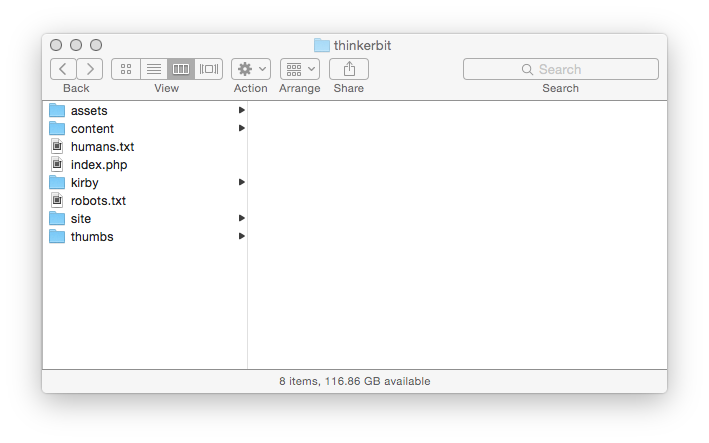
For a text-centric site like mine, the advantages still outweighed the downsides of making the switch, so I chose Kirby. The alternative, Statamic, was a little too corporate for me, and I still have a lot of trouble remembering and pronouncing its name. Kirby is friendly, and the whole darn thing can be contained in a Finder window. How cool is that?
After doing a brief experiment with Kirby and seeing how awesome it was, I began to revamp the entirety of Thinkertry.
Starting with the name.
I changed the name to Thinkerbit
I did this for a few reasons:
- The domain name was available (this was hard)
- The Twitter handle was available (even harder)
- It's less ambiguous to spell (no more "Thinker-Try" or "Thinker-Tree")
- The word "bit" hints at my tendency to focus on little details and my intent to focus on the important things - the word "try" didn't really mean anything
- It's less like my Dad's similarly-named TinkerTry.com
That last reason may seem a bit silly, but it's important. TinkerTry's growth has far exceeded the expectations of my Dad and I, which is awesome, but it also reveals the lack of planning involved when choosing "Thinkertry" as the name of my own site. After my family spent a good couple of hours helping my Dad think of TinkerTry.com, the last thing I felt like doing was thinking hard about my own experimental blog's name. I added a letter and called it a day.
The funny side effect of that decision was this:
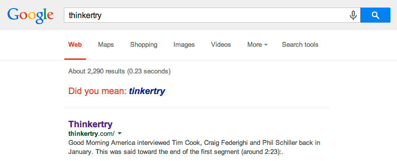
I'm not obsessed with the way this site appears in Google results, but the ghost of that decision has haunted me around the web for many years. Now that's gone.
Why the "bit"?
I've been reading stuff on the web voraciously for nearly a decade, and in that time I've grown to hate being tricked into reading crappy fluff pieces that waste my time. Articles with honest titles, concise language, clear organization and respect for their reader are what I strive to write and enjoy sharing.
This site is a place for me to practice extracting, connecting and presenting the core, central bits of the many things that I read online and the new ideas or techniques I'd like to contribute. That's been true since the beginning when I defined Thinkertry as the "bits and pieces of thought", but I think the new name reflects that idea better.
Of course, I won't always take myself so seriously here. This is also a playground where I can flex my web development and design muscles, laugh at dumb things that I think are funny, and share things that are a bit more personal. This is a blog, after all, and I plan on using it more than I do any social network.
(I also recently learned that "bits" in Information Processing Theory are what Human Factors professionals are often hired to reduce. The more bits there are to think about, the more time it takes for people to process that information, which is the basis of Hick's law. Kind of a nice tie-in with the whole KISS philosophy I'm shooting for.)
Changing the name also meant that...
I changed the URL structure (hopefully once and for all)
Over the years, a few of my articles and reviews have been linked to elsewhere on the web. When this started happening, I felt that I had an obligation to keep the URLs they were posting alive for as long as possible.
URLs may seem insignificant, but if you care about the longevity of what you publish online they're something you need to think about. Ideally, you should figure out your site's URL structure before publishing a single article. I didn't, and eventually I learned that I was paying the price.
Switching to Kirby may have been the catalyst of my hiatus, but this URL problem was the reason I couldn't turn back to Thinkertry. I didn't want to continue publishing things at URLs that wouldn't be around in the future, and would contribute to even more link rot on the web.
It took many weeks of thinking in the shower and a bunch of comparative analysis, but I think I figured out the best structure for this site and I'm sticking with it. I have enough research material and analysis to write an entirely separate article eventually, so I'll stick to the gist for now.
URLs for all of my content have gone from this:
http://thinkertry.com/2014/03/19/its-for-a-ring/
To this:
http://thinkerbit.com/links/its-for-a-ring
http://thinkerbit.com/articles/dark-matter-dark-energy
http://thinkerbit.com/reviews/nexus-7
The homepage displays articles of every type (links, articles & reviews), and each type has its own dedicated page. There are no longer any dates in my URLs (for many reasons) and the single subdirectory gives some indication of what's located there - a review, a link, a longer article, and maybe tweets eventually.
When I switched the site to Kirby and changed the structure for good, I could finally get back to writing without worrying about people linking to my stuff. That's what I did (silently) in October.
Once the new name and structure were settled, I started focusing on a variety of annoyances I had with the site.
I improved a lot of little details
A better, filterable archive
The new Archive page is significantly cleaner, simpler, and more powerful than it used to be.
The old design focused on the time that I published things. You could click a year and see everything I published that year, or a month and see everything I published that month.
But honestly, who really cares? I never used those links, and if I didn't find them useful then nobody else did either.
The old design also de-emphasized my articles and reviews by lumping them together with link posts. It was impossible to find my long-form stuff, which I typically spend a lot more time on and is (hopefully) more valuable in the long-term.
The new Archive page fixes both of these issues. It de-emphasizes the date of each item and condenses the titles into an easily-skimmable list. Those titles can be filtered by type with one click, and that's it.
You'll also notice that the "filters" are actually just links to each post type's directory. For example, thinkerbit.com/articles shows all the articles I've ever written in an archive-style format.
Eventually I may add a search field to these archive pages, but Cmd/Ctrl+F has been working pretty dandily so far.
A 'Dark Mode'
Reading websites at night is a pain in the eyes. Black text on a white background may be optimal for daytime readability, but it can cause a lot of eye strain when reading in dark environments and screw up your sleepy brain. Trust me, I know.
Dark-themed mobile apps like Instapaper, Tweetbot, Reeder and Press have spoiled me the point at which I hardly ever visit websites directly anymore (including my own), but I realize that not everyone has discovered the luxury of RSS. For those people, I've added a Dark Mode to the site.
Clicking or tapping "Dark Mode" on the top right changes the style of Thinkerbit site-wide. Whites turn to dark greys, reds turns to DSLR-inspired oranges, images become darker, and a super tiny on/off cookie is used to keep track of your preference across pages. The cookie deletes itself immediately when you close your browser - there's no tracking involved at all.
Dark Mode isn't perfect yet - you may still see an annoying flash of white light when switching pages - but I think it's a unique improvement. I'll keep working on it.
A design archive
The first design of Thinkertry.com mysteriously went missing back in 2011 and hasn't responded to my emails, but versions 2, 3 and 4 are all available in the archive for historical purposes. I'm probably the only one who cares, but that's alright. Looking back at them keeps me humble.
At the time of publishing it looks like v4 is having some video embed issues, but whatever, I'll fix it later.
Crap-free YouTube embeds
Out-of-the-box YouTube embeds are pretty terrible. They don't resize well to small screens, they put ugly suggested video thumbnails at the end of each video, and because they're an iframe (like an embedded version of a YouTube webpage) they force your web browser to download a whole bunch of unnecessary files before you even click play. 12 files, to be exact, and I only need to send you 3.
I fixed that.
Now, only the preview image of a video is downloaded from YouTube's server, and I add a YouTube-style play button over it with a clean hover effect. Once you click play, the entire iframe is downloaded and the video starts playing. On iOS a second tap is required to initiate the iframe once it's loaded, but I think that inconvenience is worth the speed improvement on mobile.
Here's an example.
A reader-friendly design
When you Google for something and click on a link, you care about the following things:
1) Finding and reading the content you're looking for
2) Making sure the site you're reading is legit and can be trusted
My priorities as a writer and a website-maker are therefore:
1) Ensuring that the article content is apparent, loads fast, and looks good on every device
2) Ensuring that the site looks legit, trustworthy and authoritative
So far I think I've done the first bullet pretty well. The second bullet I still need to work on, and I'm thinking the homepage (typically a user's second click) will be the place to do that. The large title area of v4 was a bit more than necessary, but I may do something similar.
I dropped Bluehost in favor of DigitalOcean
Bluehost, GoDaddy, Dreamhost and others are a complete ripoff for 80% of the people who need to host websites - myself included. I didn't know that back when I made TinkerTry.com for my Dad and plopped this tiny site onto his server for free, but I sure as heck know it now.
Up until about a month ago this new site was hosted on NearlyFreeSpeech for (theoretically) about a dollar per month. For comparison, Bluehost was costing my Dad and I $10/month.
Something so cheap may sound like a scam, but it wasn't - I only paid for the bandwidth and storage I used, and because NearlyFreeSpeech doesn't offer any free customer support (figuring that the only people who use their servers are geeky people who know what they're doing) they keep costs extremely low for everyone. Outages were minimal, speeds were way more consistent, and after testing my site with them for over half a year I was pretty pleased with them overall.
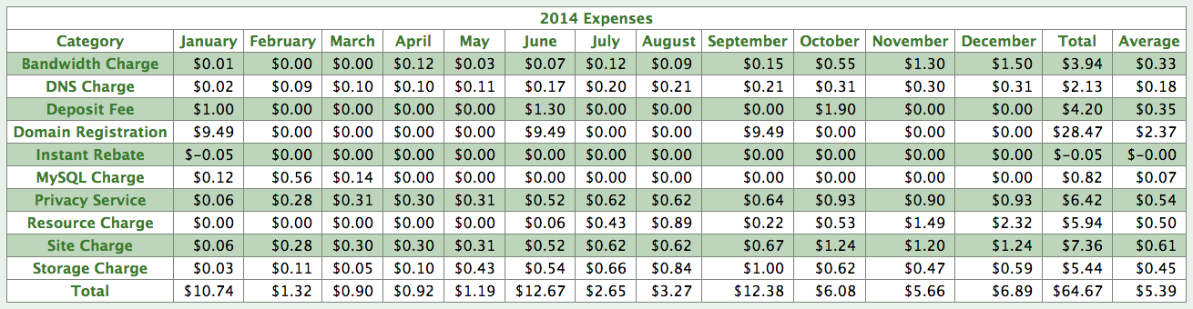
Except, I wasn't quite spending that little per month. This is what I spent in 2014:
And 2015 so far:
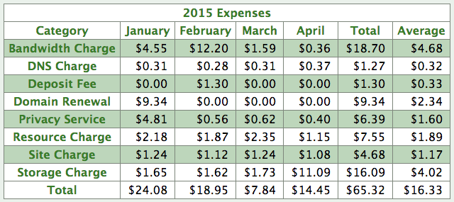
This data is a bit muddled because I added two additional (small) sites and domains during the time I was with them, but the gradual price creep is pretty evident, and February 2015's crazy $12.20 bandwidth charge was the result of a sudden spike in spam traffic from Russia. I wasn't too fond of paying for crazy Russian servers to jam my site with fake requests and downloading my images repeatedly, so I had to leave.
I'm glad I did. DigitalOcean has been awesome so far for a flat $60/yr. It's still very geeky - I had to learn my way around a Linux terminal to set it up - but the speeds are ridiculously good compared to anything else I've used.
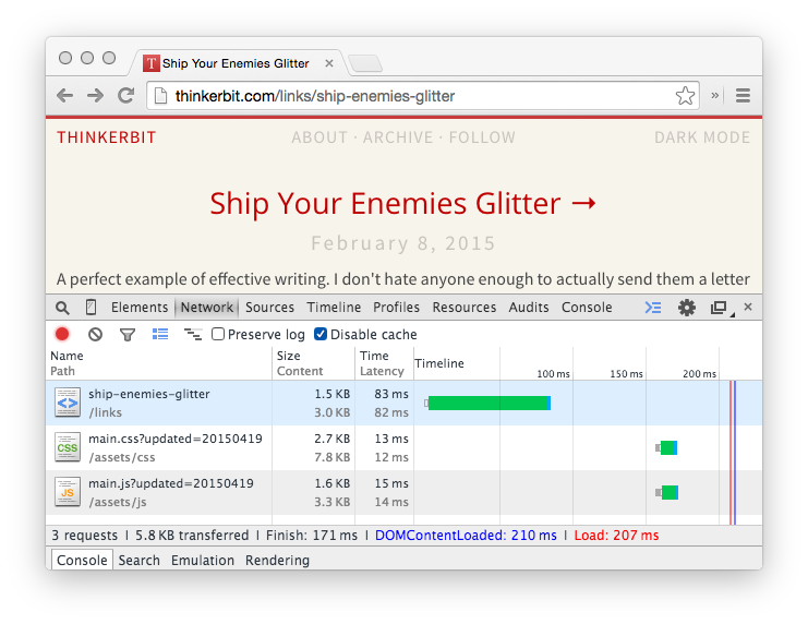
I'm currently seeing under 200ms to load a page over ethernet. Adding Google Analytics' tracking code makes the actual load time a bit longer, but the perceived load time is still awesome. Even simulating a 2G (250 Kbps) connection on a phone, navigating between pages is still faster than most sites - especially text-only posts or pages with just a single YouTube embed.
The sheer speed of Thinkerbit v5 is probably the thing I like most about it. It wouldn't have been possible with WordPress without paying some serious bucks, and I'm doing it for $5/mo.
I still need to fix things
I've learned a lot about web design and development in the last year or so. Way more than I knew before switching to Kirby, and 100X more than I did when I made Thinkertry v1 back in 2011.
Although I'm finally starting to feel good about this site's performance and underlying code, there are still some niggling things that are annoying enough to pop into my head from time to time, but not important enough to delay this launch post before fixing.
For example, the front page currently has the full text of my most recent posts. That's great, but when I post a review with 20+ images that can significantly increase the front page's weight. I need to make certain posts, like reviews, truncated to prevent that.
When you're on the About, Archive or Follow pages, their respective menu item at the top should indicate that you're already on that page. Right now it's unclear.
The "MENU" button that appears on small screens is very rough right now. I think it's better than many of the junky, over-animated hamburger menus on other sites, but it's still not what I'd like.
Having a search field in the archive page might be useful, but I want to get it right before implementing it. I'd like to see if Kirby's search is powerful enough to replace Google.
The source code and CSS/JS files of this site have some cruft and old code that needs to be removed and optimized eventually. That will probably be true for the next decade, so I've stopped worrying about it.
Clicking or tapping on images brings you to their native file location instead of zooming in or displaying them in a nicer format. This is a tricky problem to fix across platforms, but I'm close.
Right now I think the design of the site lacks personality. Particularly the front page. Nothing visually distinguishes links vs articles vs reviews, and I think I can present things a little more creatively without adding unnecessary cruft.
At the moment, embedded videos don't appear in Thinkerbit's RSS feed because of the crap-free YouTube trick I implemented. This is my biggest annoyance right now, and the first thing I'll try to fix.
I'm also experimenting with hosting the site's RSS feed entirely myself, but tracking followers is a challenge. Right now I'm using Marco Arment's PHP-based Feedburner replacement but it's not quite perfect either.
Lastly, direct image URLs currently display numbers and an extra /content/ directory like this:
http://thinkerbit.com/content/reviews/05-wreck-it-ralph/logo.png
This won't affect most people, but it does mean that image previews on Facebook or Google+ may get screwed up down the line when I try to remove the /content/ directory from these URLs. This is one of the last Kirby-related issues I'm struggling with.
I'm still reading, learning, and improving
During Thinkertry's first year I learned that attempting to cover the consumer tech news cycle is pretty much suicide. Last year a promising site called Tab Dump did a pretty great job at it, but shortly before burning out, Stefan Constantine was hired away.
From Tab Dump's last post, The End. For Now.
... I found myself simply not caring about what was going on in the tech space. That's not to say I don't find technology absolutely fascinating, I do, it's the never ending coverage of every trivial detail that turns me off. I enjoy reading a 10,000 word AnandTech article as much as the next soldering iron and multimeter packing geek, but the needless drama around Bash, iOS 8.0.1, and whatever new quote that leaves Eric Schmidt's mouth is frankly tiring and mentally exhausting.
The day that Thinkertry became a thing, the way I read articles from Engadget and other sources completely changed. Every article that passed through my RSS reader was something that I could potentially write about, and the rate at which I consumed articles was dramatically slowed down.
After deleting more 1,000+ word draft posts than I care to admit and repeatedly slashing through my Instapaper queue over the years, I like to think that I'm better at spotting what's worthwhile today than I was back when I started writing. These days the articles that get stuck in my feed reader are more often related to design or web development than consumer technology, simply because I'm less able to distinguish between the noise and signal related to those topics. Eventually I'll get better at filtering those too, and I think that's one of the hidden benefits of having a personal blog like this one - I'm paying more attention and learning far more than I used to as a casual consumer of information.
Thinkerbit is frequently a personal exercise in web design and web programming, sure, but its primary purpose is to help me write better. I'd like to eventually optimize, or design, my own unique form of writing by talking about a variety of topics here, and I think I need to focus on that a bit more now that the infrastructure is mostly figured out.
Thanks for reading, and I'll keep writing.