Updating Apps, or Installing App Updates? →
There are a couple of things about updating apps through the Windows Store in Windows 8 that strike me as a bit odd. Let me take you through the process.

First you tap/click on the Windows Store tile to open it up (which makes sense). Next, you have to spot the tiny green "Updates (5)" text way up in the top-right corner. If this is the first time you've opened the Windows Store tile in a while, that text doesn't even appear until a second later when it fades in. Once it does, you click/tap it to continue.

This is the slick-looking (and very minimal) App updates screen. Every app update is automatically selected, letting you quickly tap/click "Install" on the bottom to start updating your apps. There are a couple of problems here though. If you want to view the release notes associated with each app update, you need to manually deselect every app tile except for the one you want to learn more about (presumably using the "Clear" button on the bottom left, if you remember that it's there), at which point a Details button appears next to Install on the bottom. This is a pretty big pain for people who care about what's new in an update, and judging by the Apple App Store's new update page (which includes 1-tap access to release notes) I suspect that a lot of people would like a more efficient way to access that info.
This would take up more space than the current update screen, but I think two vertically-spaced rows (more or less, depending on the screen's resolution) with scrollable release notes below them might make things more efficient for both desktop and tablet-based users. I made a quick mock-up of what it might look like below. It isn't perfect, but it'd let the user see what changes are about to be made to an app without having to go through this tedious process. (And I realize the text is the same thing copied over and over - just imagine the text areas being more varied than they are here, some with bullets, some with longer paragraphs, etc.)

The second arguable nitpick on this screen is the verbiage. While you do technically install things when you update apps, I don't think my grandpa would mind if the button on the bottom said "Update" instead of "Install", particularly since this is the "App updates" screen according to the text on the top. It's not wrong, but it's inconsistent and not perfectly clear the way it is now.
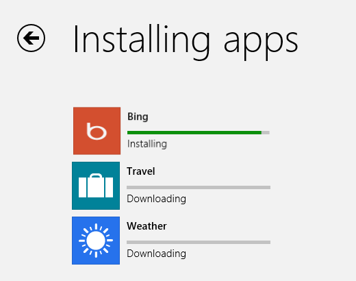
From this screen onward through the process, "Install" is used instead of "Update". The below is what it looks like when apps are actually in the process of being updated installed (which is very quick, by the way).

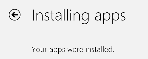
And to finish the process off, the final screen tells you that your apps have been "installed" instead of "updated". Alright...

So yup, there are some possible improvements. We'll see if Microsoft actually decides to tweak this process at all - as it is right now I think they should at least consider it.